Goal-oriented modelling is one of the most important research developments in the requirements engineering (RE) field. This paper conducts a systematic analysis of the visual syntax of i*, one of the leading goal-oriented languages. Like most RE notations, i* is highly visual. Yet surprisingly, there has been little debate about or modification to its graphical conventions since it was proposed more than a decade ago. We evaluate the i* visual notation using a set of principles for designing cognitively effective visual notations (the Physics of Notations). The analysis reveals some serious flaws in the notation together with some practical recommendations for improvement. The results can be used to improve its effectiveness in practice, particularly for communicating with end users. A broader goal of the paper is to raise awareness about the importance of visual representation in RE research, which has historically received little attention.
1.1 Visual syntax: an important but neglected issue
Visual notationsFootnote 1 play a critical role in requirements engineering (RE), and have dominated research and practice from its earliest beginnings. Virtually all RE notations use diagrams as the primary basis for documenting and communicating requirements. For example, the “structured techniques” of the 1970s, probably the first RE techniques, were highly graphical. This was their major distinguishing feature compared to previous (text-based) techniques and claimed as one of their major advantages [16, 22]. This pattern continues to the present day, with UML (the industry standard modelling language) and i* (one of the most influential modern RE notations) also being visual notations.
This makes it all the more surprising that visual representation issues receive so little attention in RE research. Evaluations and comparisons of RE notations tend to be conducted based primarily on their semantics, with issues of visual syntax rarely mentioned. In designing notations, the majority of effort is spent designing the semantics of notations (what constructs to include and what they mean), with design of visual syntax (how to perceptually represent these constructs) taking place largely as an afterthought. There is also little or no attempt to justify the symbols chosen (design rationale) [33, 58].
1.2 i*: A goal-oriented modelling language
Goal-oriented modelling is one of the most important research developments in the RE field. This shifts the focus from what and how (data and processes) as addressed by traditional analysis to who and why (the actors and the goals they wish to achieve). Goal-oriented modelling addresses the early analysis or requirements elicitation phase in the RE process [11]. i* [90] is one of the most widely used goal modelling languages [2] and vies with KAOS [14] as the leading goal modelling notation.
1.2.1 A highly visual language
Like most RE notations, i* is a visual language. In fact, it is more visual than most: every construct in the language is represented graphically and i* models are defined only by diagrams (rather than diagrams plus supporting text as is usually the case). i* uses two diagram types to document requirements, which correspond to different levels of abstraction (Fig. 1):
Strategic Dependency (SD) Diagrams (intentional level) define dependencies among actors, treating each actor as a “black box”.
Strategic Rationale (SR) Diagrams (rational level) define the internal rationale or intentions of each actor (shown within dotted circles), corresponding to a “glass box” view of actors.
1.2.2 Lack of design rationale
Like most RE notations, i* lacks explicit design rationale for its graphical conventions: in all the sources of i* [26, 89, 90], symbols are defined without any explanation of why they were chosen. In fact, i* contains less design rationale than most RE notations: graphical conventions are mostly defined by example without even being described in the text. For example, this is how the visual syntax of SD diagrams is defined in the original source of i*:
Figure 2 shows an SD model of the meeting scheduling setting with a computer-based meeting scheduler.
Fig. 2
Scope: this paper focuses on the top left hand quadrant of the diagram (visual syntax) and excludes semantic and sentence-level issues
Goal-oriented modelling has been enthusiastically embraced by the RE research community but has so far had negligible impact on practice [19]. As Lockerbie and Maiden say [45]:
Whilst the i* approach [1] has been developed and applied to case studies for some time, it has not been applied widely in industrial requirements projects
A recent survey of practice [15] showed that the most widely used RE notations in practice are Data Flow Diagrams (DFDs) and Entity Relationship (ER) models, both developed in the 1970s. i* was not even mentioned by survey participants, suggesting an adoption rate of close to zero. This should be of major concern to RE researchers: while there is always inertia to adopt new methods [8], it has been over a decade since i* was proposed (around the same time the first version of UML was released).
1.3 Objectives of this paper
This paper conducts an systematic analysis of i* visual syntax, the first so far conducted. We believe such an analysis is long overdue as there has been little debate about or modification to its graphical conventions since it was originally proposed (more than a decade ago). It is always easy to criticise, but our aim in conducting this analysis is constructive: to improve i*’s usability and effectiveness in practice, especially for communicating with end users. In this spirit, rather than simply pointing out problems, where possible, we suggest ways of resolving them.
A broader goal of this paper is to raise awareness about the importance of visual representation issues in RE, which have historically been ignored or undervalued. Visual syntax has a profound effect on the effectiveness of RE notations, equal to (if not greater than) than decisions about semantics [58]. For this reason, it deserves (at least) equal effort and attention in evaluating and designing RE notations.
2 Previous research
A review of the literature revealed no previous analyses of i* visual syntax. i* has stimulated an enormous amount of research, with over 1,000 citations to its primary sources [89, 90]. Given that it is primarily a visual language, it is surprising that none of these papers relate specifically to its visual syntax. While some papers propose changes to its visual syntax, this is typically only to reflect changes or extensions in semantics (e.g. [18]).
Despite the lack of analyses of i* visual syntax, there is a widespread perception in the literature that the i* visual notation is effective (italics added below):
The undoubted strengths of i* include a simple but formal and stable semantics, a graphical modelling notation that is simple to use, models that are amenable to computational analysis, and applicability in both agent-oriented and goal-oriented requirements methods. [46]
i* allows for the clear and simple statement of actor’s goals and dependencies among them. It also includes a graphical notation which allows for a unified and intuitive vision of the environment being modelled, showing its actors and the dependencies among them. [2]
However, the effectiveness of the visual notation is stated rather than shown: in the absence of formal analyses, it is impossible to say whether it is effective or not. One goal of this paper is to determine whether statements like these are justified.
The lack of attention to i* visual syntax reflects a common pattern in RE research, where issues of visual representation are rarely given the attention they deserve. One possible reason for this is that methods for analysing visual syntax are less mature than those available for analysing semantics [29, 48, 87] (an issue this paper also addresses). However, another explanation is that researchers consider visual syntax to be unimportant: a matter of “aesthetics” rather than effectiveness [33]. This view is contradicted by research in diagrammatic reasoning, which shows that the form of representations has an equal, if not greater, influence on human understanding and problem solving performance as their content [42, 76]. Empirical studies confirm that the visual appearance of RE notations significantly affects understanding, especially by novices [51, 62].
3 Theoretical basis
As discussed in the previous section, one possible reason for the lack of attention to i* visual syntax is the lack of accepted principles for evaluating and designing visual notations. In the absence of such principles, evaluations can only be carried out in a subjective manner. The analysis in this paper is based on a recently proposed theory of visual notations, called the Physics of Notations as it focuses on the physical (perceptual) properties of notations rather than their logical (semantic) properties [58]. This provides a scientific basis for comparing, evaluating, improving, and constructing visual notations, which has previously been lacking in the RE field.
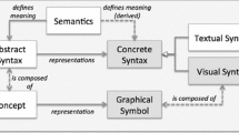
3.1 Definitions: the anatomy of a visual notation
A visual notation consists of a set of graphical symbols (visual vocabulary), a set of compositional rules for forming valid expressions (visual grammar), and semantic definitions for each symbol (visual semantics). The set of symbols and compositional rules together form the visual (concrete) syntax. Graphical symbols are used to signify or symbolise (perceptually represent) semantic constructs, typically defined by a metamodel. An expression in a visual notation is called a visual sentence or diagram. Diagrams are composed of instances of graphical symbols (symbolinstances or tokens), arranged according to the rules of the visual grammar. In this paper, we focus only on visual syntax: how constructs are perceptually represented; issues of semantics are specifically excluded (Fig. 2).
3.2 The dependent variable (design goal): what makes a “good” visual notation?
Visual notations are uniquely human-oriented representations: their primary purpose is to facilitate human communication and problem solving [31]. To be most effective in doing this, they need to be optimised for processing by the human mind. Cognitive effectiveness is defined as the speed, ease and accuracy with which a representation can be processed by the human mind [42]. This provides an operational definition of visual notation “goodness” that can be empirically evaluated. The Physics of Notations defines this as the primary dependent variable for evaluating and comparing visual notations and the primary design goal in constructing them. Cognitive effectiveness determines the ability of visual notations to support communication with business stakeholders as well as reasoning and problem solving by requirements engineers.
The cognitive effectiveness of visual notations is one of the most widely accepted and infrequently challenged assumptions in the RE field. However, as Larkin and Simon showed in their seminal paper, “Why a Diagram is (Sometimes) Worth 10,000 Words”, cognitive effectiveness is not an inherent property of visual representations but something that must be designed into them [42]. All visual representations are not equally effective and poorly designed visual representations can be far less effective than text.
3.3 The visual notation design process
The Physics of Notations conceptualises the process of visual notation design as consisting of three “spaces”: the problem space, the design space, and the solution space.
3.3.1 The problem space
In any graphic design task, the starting point is always the information content to be expressed: form follows content. In visual notation design, the problem space is defined by the notation semantics, which should be defined by a metamodel [35, 65] and formal semantics [32].
3.3.2 The (graphic) design space
The design space is the set of all possible graphical encodings of a particular notation semantics. This defines a set of semantically equivalent but cognitively inequivalent visual notations. There are 8 elementary visual variables which can be used to graphically encode information [4]. These are categorised into planar variables (the two spatial dimensions) and retinal variables (features of the retinal image) (Fig. 3). These define the dimensions of the graphic design space. They also define a visual alphabet for constructing visual notations: any graphical symbol can be defined by specifying particular values for the visual variables (e.g. shape = rectangle, colour = green) [49]. Notation designers can create an infinite number of graphical symbols by using different combinations of values of these variables.
Fig. 3
The design space: the visual variables define a set of building blocks for constructing visual notations
Designing cognitively effective visual notations is a problem of choosing the most cognitively effective representations from the infinite possibilities in the graphic design space. Principles of visual perception and cognition provide the basis for making informed choices among the alternative graphical encodings in the graphic design space.
3.4 Principles for designing cognitively effective visual notations
The practical (prescriptive) component of the Physics of Notations is a set of nine principles for designing cognitively effective visual notations. These are summarised briefly belowFootnote 2:
1.
Semiotic Clarity: there should be a 1:1 correspondence between semantic constructs and graphical symbols
2.
Perceptual Discriminability: symbols should be clearly distinguishable from one another
3.
Semantic Transparency: use symbols whose appearance suggests their meaning
4.
Complexity Management: include explicit mechanisms for dealing with complexity
5.
Cognitive Integration: include explicit mechanisms to support integration of information from different diagrams
6.
Visual Expressiveness: use the full range and capacities of visual variables
7.
Dual Coding: use text to complement graphics
8.
Graphic Economy: keep the number of different graphical symbols cognitively manageable
9.
Cognitive Fit: use different visual dialects for different tasks and/or audiences
All principles define desirable and measurable properties of notations, so provide a basis for evaluation and design. Improving a visual notation with respect to any of the principles will increase its cognitive effectiveness (subject to tradeoffs among them). The Physics of Notations thus defines a causal theory, which posits (positive) causal relationships between each principle and cognitive effectiveness (Fig. 4). In the language of scientific theories, the principles represent independent variables, while cognitive effectiveness is the sole dependent variable. Most importantly, the principles are evidence based: they were synthesised from theory and empirical evidence from a wide range of fields.
Fig. 4
Causal structure of the Physics of Notations (using standard scientific notation for representing theories [68])
In all design tasks, there are tradeoffs among design goals [1]. Figure 5 summarises the interactions among the visual notation design principles (effects are not necessarily symmetrical). Knowledge of these interactions can be used to make tradeoffs (where principles conflict with one another) and exploit synergies (where principles aid port one another one another). The objective should be to satisfy all principles to an acceptable level, rather than to optimise some at the expense of others.
Fig. 5
Interactions between principles: + (red cell) indicates a positive effect, − (green cell) indicates a negative effect, and ± (orange cell) indicates either a positive or negative effect depending on the situation
Visual notation design is a goal-oriented activity (like any design task), so it should be possible to represent the Physics of Notations as an i* model. The dependent variable (cognitive effectiveness) is operationally defined, so corresponds to a goal in i*. The principles represent desirable and measurable properties of notations, so also correspond to goals. Logically then, the relationship between the principles and cognitive effectiveness (shown in Fig. 4) could be represented using decomposition relationships. However, goals cannot be decomposed in i* (only tasks can be). Another possibility would be to relate them using means-end relationships. However, i* does not allow goals to act as means: only tasks can.Footnote 3 Finally (and we are running out of relationship types here), we could consider that each principle contributes to the overall goal of cognitive effectiveness: these would be help contributions (as each principle positively affects cognitive effectiveness but satisfying any single principle is not enough to achieve cognitive effectiveness). However, i* does not allow contributions to goals (only to softgoals or beliefs). As a result, there seems to be no way of representing the Physics of Notations using i* (Fig. 6).
Fig. 6
The relationships among the principles and cognitive effectiveness defined in the Physics of Notations cannot be represented using i*. The leftmost cell shows the relationships using standard scientific notation (a causal graph), while the cells on the right attempt to show the same relationships using i*: however, all result in violations to i* grammatical rules
It is also not possible to represent the interactions among the principles (shown in Fig. 5), which correspond semantically to help, hurt or combined help/hurt contributions, as i* does not allow goals to be the target of contributions. The inability to represent the Physics of Notations using i* suggests a possible problem with its semantics: its grammatical rules are too restrictive and exclude valid situations that can occur in the real world [28].
4 Research approach
4.1 Unit of analysis: choosing an appropriate source
The first issue we faced in conducting our analysis was to choose a particular source of i* as the basis for our analysis: there is no single definition of the language as there is, say, for UML. There are multiple versions and variants of the i* notation, often not fully defined and even contradictory [2]. A review of the literature revealed 4 leading candidates for our analysis:
The original i* notation as defined in Eric Yu’s doctoral thesis [89] and RE’97 paper [90]. These are the most cited sources but are becoming rather dated as both are more than 10 years old. They are also unlikely to be used in practice as they (a) are written for an academic audience; (b) [89] is not electronically available; (c) [90] lacks sufficient detail to apply the language in practice.
The goal-oriented modelling component of Tropos [6], which was originally based on i* but has since followed its own evolutionary path. Tropos has the advantage of having an explicit metamodel but differs from standard i* in both syntax and semantics.
The Goal-oriented Requirements Language (GRL), which has recently been adopted as an international standard in the telecommunications field [36]. Like Tropos, GRL has an explicit metamodel but differs in both syntax and semantics from standard i*.
The i* Guide 3.0 [26], available in the form of a Wiki.
We chose the i* Guide [26] for the following reasons:
It so represents the most up-to-date source. Being Wiki-based represents a “living” version of the language, while most other sources represent “snapshots” at a point in time.
It provides the most detailed description of i* visual syntax.
Being web-based, it is the most easily accessible source, so most likely to be used by potential i* users. Empirical studies show that web-based sources are generally preferred to other sources [43].
It is the only interactive source: it is based on Wiki technology, so is able to incorporate feedback from the i* user community. For this reason, it is most likely to reflect i* as actually used in practice.
However, the differences in visual syntax between the different sources of i* are relatively minor, so most of our findings will apply to the other sources as well.
4.2 Structure of analysis
The visual notation design principles defined in the Physics of Notations were used to conduct a systematic, symbol-by-symbol analysis of the i* visual notation. The findings for each principle are reported in separate sections (Sects. 5–13). The analysis for each principle is structured as follows:
Definition of principle
Results of evaluation
Recommendations for improvement
Interactions with other principles (where relevant)
4.3 Typographical conventions
Cross-references between principles are indicated by underlining; new or important terms by bolding; and i* concepts by small capitals.
5 Semiotic Clarity
5.1 Definition of principle
The Principle of Semiotic Clarity states that there should be a 1:1 correspondence between semantic constructs and graphical symbols. This is necessary to satisfy the requirements of a notational system, as defined in Goodman’s theory of symbols [24]. When there is not a 1:1 correspondence, one or more of the following anomalies can occur (Fig. 7):
Fig. 7
Principle of Semiotic Clarity: there should be a 1:1 correspondence between semantic constructs and graphical symbols
Symbol deficit: when a semantic construct is not represented by any symbol
Symbol redundancy: when a semantic construct is represented by multiple symbols
Symbol overload: when the same symbol is used to represent multiple constructs
Symbol excess: when a symbol does not represent any semantic construct.
Semiotic Clarity maximises expressiveness (by eliminating symbol deficit), precision (by eliminating symbol overload), and parsimony (by eliminating symbol redundancy and excess) of visual notations.
Evaluating semiotic clarity involves conducting a two-way mapping between a notation’s metamodel and its symbol set (visual vocabulary). This is problematic for the i* Guide, as it does not include an explicit metamodel. While Yu’s PhD thesis [89] includes a metamodel, it is incomplete and represented using non-standard conventions (using Telos [61]). There have been several proposals for i* metamodels in the literature [2, 21], but these have no official status as they were reverse engineered from text and examples describing i*. There are also metamodels for variants of i* such as GRL [36] and Tropos [5, 6]. A problem with all of these for the purposes of our analysis is that they relate to syntactically different versions of i* (different visual dialects) to that defined in the i* Guide. To conduct semiotic analysis, we need a metamodel specific to the notation: an approximate one is not good enough. For this reason, we reverse engineered a metamodel (or more precisely, a metaclass hierarchy) from the i* Guide.
5.1.1 Why i* needs a metamodel
A clear recommendation from this research is that i* needs an official metamodel. To facilitate communication and tool support, this should be represented using industry standard conventions (e.g. using the Meta Object Facility (MOF) [65] or the recently defined ISO/IEC Standard 24744 [35]). Currently, both i* semantic constructs and grammatical rules are defined using natural language, which leads to problems of inconsistency, ambiguity, and incompleteness [2]: an explicit metamodel would help resolve such issues. i* was developed before meta-modelling was standard practice in defining software language engineering so it is not surprising that it did not have one when it was first defined. What is surprising is that it still doesn’t have an official metamodel after more than 10 years in use. Metamodelling represents current best practice in software language engineering: not having one represents a barrier to learning, correct usage, and tool support.
5.2 Results of evaluation
5.2.1 Metaclass hierarchy
The metaclass hierarchy for the i* Guide is shown in Fig. 8: this defines an inheritance hierarchy consisting of semantic constructs (metaclasses) and generalisation relationships among them. Abstract metaclasses (constructs that cannot be instantiated) are shown as dotted boxes. We adopt the UML convention of inheriting from a single (root) element and distinguishing between relationships and other element types: all i* relationships are directed relationships. It is often difficult to determine from the textual descriptions in the i* Guide what is a separate “construct”. To avoid making arbitrary judgements about this, we considered everything with a separate entry or heading in the Wiki to be a construct. However, without an official metamodel, semiotic analysis can only be conducted in an approximate manner.
Fig. 8
Metaclass Hierarchy for i*: each element on the diagram corresponds to a semantic construct (metaclass), with dotted elements showing abstract metaclasses
The i* visual vocabulary is summarised in Fig. 9. Symbols are categorised as 2-D symbols (areas or node types), 1-D symbols (lines or link types), and spatial relationships [13].
There are 31 semantic constructs in i*, consisting of 9 element types and 21 relationship types: this defines the semantic complexity of the notation. There are 16 visually distinct graphical symbols in the i* visual vocabulary, consisting of 11 node types, 4 line types, and 1 spatial relationship: this defines the graphic complexity of the notation. Two symbols are visually distinct if and only if they have a different value for at least one visual variable. This is based on the definition of a graphical symbol (Sect. 3.1): a graphical symbol is defined by specifying particular values for the 8 visual variables.
Any discrepancy between the number of constructs and the number of symbols in a notation is due to semiotic clarity anomalies. The equation below defines the relationship between the number of constructs, the number of symbols, and violations to semiotic clarity.
The results of the semiotic clarity analysis are summarised in Table 1: there is a minor problem of symbol redundancy, a major problem of symbol overload, and no symbol excess or symbol deficit. There is a negative symbol balance (number of symbols − number of constructs) of 15, mainly due to symbol overload.
There are two instances of symbol redundancy or synographs (the graphical equivalent of synonyms) in i*. The first and most obvious case is that two alternative symbols may be used to represent beliefs (Fig. 10). No explanation is given for why a choice is provided, which is not provided for any other construct. This places a burden of choice on the notation user to decide which symbol to use and an additional load on the reader to remember multiple representations of the same construct.
A less obvious form of symbol redundancy (a rare case of between-diagram symbol redundancy) is that actors are shown in different ways on different diagram types: as circles on SD diagrams and as a compound symbol (a circle superimposed on a larger, dotted circle) on SR diagrams (Fig. 11). This is an unusual representation choice, and the rationale for this is not explained. In most visual notations, either the same symbol is used to represent the same construct at different levels of abstraction (e.g. UML packages are shown using the same symbol but larger in size when their contents are expanded) or the symbol disappears at the lower level (e.g. when processes are exploded to lower level diagrams in DFDs). Using different symbols also leads to potential problems of Cognitive Integration.
Fig. 11
Inter-diagram symbol redundancy: actors are shown using different symbols on SD diagrams (left) and SR diagrams (right)
Symbol overload is the worst type of anomaly as it results in perceptual ambiguity and the potential for misinterpretation [24]. There are 17 instances of symbol overload or homographs (the graphical equivalent of homonyms) in i*. All of these occur among relationship types: there are 22 distinct semantic relationship types but only 5 visually distinct graphic relationships: on average, each graphical link has to convey more than 4 different meaningsFootnote 4 (Table 2). The symbol overload for a given symbol is the number of constructs it represents minus one (as each symbol should represent at most one construct).
Table 2 Symbol overload analysis of i* relationships
The high level of symbol overload in i* is due to:
Contextual differentiation: actor associations and contributions use the same graphical link but connect different types of elements. The 4 types of strategic dependencies are also differentiated by context (the type of dependum). Contextual differentiation violates one of the basic properties of the symbol system of graphics: monosemy, which means that all symbols should have a single meaning, defined in advance and independent of context [4].
Textual differentiation: labels are used to distinguish between 6 types of actor associations and 9 types of contributions. Adding text to a graphical symbol does not result in a new symbol as text is not a visual variable: a graphical symbol is fully defined by its values for the 8 visual variables. Textual differentiation is discussed in more detail under Perceptual Discriminability.
5.2.6 Symbol excess (visual noise)
There are no instances of symbol excess in i*.
5.2.7 Symbol deficit (visual silence)
There are no instances of symbol deficit in i*. However this is not necessarily a good thing as some level of symbol deficit is normally required to keep graphic complexity manageable (see Graphic Economy). It is highly unusual (and generally undesirable) for any RE notation to show all constructs in graphical form.
5.3 Recommendations for improvement
To improve semiotic clarity of i*, all instances of symbol redundancy and overload should be removed.
5.3.1 Remove synographs
Symbol redundancy can be resolved by choosing one of the symbols to represent the construct and removing the other symbol(s) from the notation. As we will see, later principles provide clear guidelines for choosing between the alternative belief symbols (Perceptual Discriminability and Semantic Transparency). A potential solution to the problem of different symbols for actors on SD and SR diagrams is proposed in Cognitive Integration.
5.3.2 Remove homographs
Symbol overload can be resolved by using visual variables (instead of text or context) to distinguish between symbols. Potential solutions to symbol overload are discussed under Perceptual Discriminability (as symbol overload is a special case of perceptual discriminability).
5.4 Interactions with other principles
Semiotic Clarity has important interactions with Complexity Management and Graphic Economy. It can have either positive or negative effects on these principles (Fig. 12):
Fig. 12
Interactions between Semiotic Clarity and other principles (like Fig. 6 this also violates rules for showing contributions in i*)
Symbol deficit has a positive effect on Complexity Management by decreasing diagrammatic complexity (the number of diagram elements or symbol tokens) and on Graphic Economy by decreasing graphic complexity (the number of symbol types in the notation).
Symbol overload has a positive effect on Graphic Economy but no effect on Complexity Management: it reduces the number of symbol types but does not affect the number of symbol tokens.
Symbol excess has a negative effect on both Complexity Management and Graphic Economy as it increases both the number of symbol types and symbol tokens.
Symbol redundancy has a negative effect on Graphic Economy but no effect on Complexity Management as it increases the number of symbol types but the number of symbol tokens stays the same.
6 Perceptual Discriminability
6.1 Definition of principle
Perceptual Discriminability refers to the ease and accuracy with which symbols can be differentiated from each other. Accurate discrimination between symbols is a prerequisite for accurate interpretation of diagrams [87]. Discriminability is determined by the visual distance between symbols, which is measured by the number of visual variables on which symbols differ and the size of these differences (measured by the number of perceptible steps). While each visual variable has an infinite number of possible values, it only has a finite number of perceptible steps (values that are reliably discriminable by the human mind). In general, the greater the visual distance between symbols, the faster and more accurately they will be recognised [88]: if differences are too subtle, errors in interpretation can result. Discriminability requirements are much higher for novices than for experts as we are able to make much finer distinctions with practice [7].
6.2 Results of evaluation
6.2.1 Similarity of shapes
Of all visual variables, shape plays a privileged role in perceptual discrimination, as it is the primary basis on which we classify objects in the real world. This means that more than any other variable, shapes used to represent different constructs should be clearly distinguishable from one another. Figure 13 shows the shapes used in i*. Experimental studies show that entities (rectangles) and relationships (diamonds) are often confused by novices on ER diagrams [62]. This suggests that similar—or more likely worse—confusion is likely to occur between i* symbols, as there are more symbols and less obvious differences between them.
In particular, the shapes used to represent goal and belief are very similar and do not represent perceptible steps of the visual variable shape. A similar problem exists with agents and roles, which have a very subtle difference: agents have a straight line at the top of the symbol while roles have a curved line at the bottom. No explanation is given for these graphic design choices (top versus bottom = vertical position and straight versus curved = shape), suggesting they are arbitrary. Having some rationale would help people remember which is which (Semantic Transparency), as these symbols are frequently confused in practice.
6.2.2 Shape inconsistency
Discriminability problems can also occur when dissimilar shapes are used to represent the same or similar constructs. This is a problem of visual-semantic congruence: the visual distance between symbols should be consistent with semantic distance between the constructs they represent. In general, similar shapes should be used to represent similar constructs: family resemblances among shapes can be exploited to show family relationships among constructs [29].
This requirement is clearly violated in i*, where one of the subtypes of actor (position) is represented by a shape from a different shape family (Fig. 14).Footnote 5
Fig. 14
Shape inconsistency (actor types): which is the odd one out?
A similar issue exists with goals and softgoals: shapes from different families are used to represent these concepts when they represent the same (or very similar) things. While much is often made of the difference between goals and softgoals in i*, the semantic distance between these concepts is really quite small. In ontological terms, both represent states of the world an actor desires to achieve [84]. The only difference is that a goal has explicit measures defined while a softgoal can only be evaluated subjectively. A softgoal can become a goal if it is operationalised (i.e. made measurable), suggesting these are not different constructs but different states of the same construct.
6.2.3 Discriminability of relationships: strategic dependencies
strategic dependencies in i* are represented by lines with the letter “D” attached to each side (Fig. 15), with the orientation of the letters indicating the direction of the dependency (the “D”s point towards the dependee). This convention is one of the most distinctive (and peculiar) characteristics of the i* visual notation and makes i* diagrams immediately recognisable.
Fig. 15
How many commitments does Actor 1 have? Conscious effort is required to distinguish between vulnerabilities and commitments
However, this is not particularly effective as a visual representation technique:
The letter “D” is too symmetrical, making it perceptually difficult to identify the direction of the dependency (which way the “D” is pointing). In contrast, direction of conventional arrows (which use “V”s or triangles) can be perceived unambiguously.
Attaching “D”s to both sides of the dependency exacerbates this problem, as it requires conscious effort to determine which actor is the depender (the origin of the dependency, who is vulnerable to the dependee) and which is the dependee (the target of the dependency, who has a commitment to the depender). Using conventional arrows, it is easy to distinguish between the origin and destination simply by looking at which end the arrowhead appears.
6.2.4 Discriminability of relationships: textual differentiation
Textual differentiation is commonly used in UML to distinguish between symbols, and many notations have since followed their lead. However, this is not a graphic design practice that should be emulated, as it is cognitively ineffective [60]. Textual differentiation is an extreme case of perceptual discriminability where symbols are not just similar but visually identical: symbols that are differentiated only by text have zero visual distance.
i* uses textual differentiation: to an even greater extent than UML. In fact, most of its relationship types (around 70%) are differentiated in this way (Fig. 16): 6 types of actor associations and 9 types of contributions, which accounts for most of the symbol overload in the notation (Semiotic Clarity).Footnote 6
There are a number of problems with using text to differentiate between symbols:
The first is a syntactic one: visual variables form the building blocks for constructing visual notations while alphabetic characters form the building blocks for constructing textual languages. Text is not a visual variable and using it to differentiate between graphical symbols violates the rules of the symbol system of graphics [4].
It reduces speed and accuracy of perceptual discrimination: text processing relies on slower, sequential cognitive processes [60]. To maximise discriminability, symbols should be differentiated using visual variables so that differences can be detected automatically and in parallel using perceptual processes.
It confounds the role of labels in diagrams. Labels play a critical role at the diagram (sentence) level to differentiate between symbol instances (tokens) and define their correspondence to the real world (Fig. 17). Using labels to differentiate between symbol types (at the language level) confounds this role. In general, text is an effective way to distinguish between symbol instances but not between symbol types. At the notation level, labels should appear as placeholders (variables) rather than literals (constants).
Fig. 17
Correct use of labels: to differentiate between symbol instances (tokens) and define correspondence to the real world at the diagram level
Using labels to distinguish between relationship types precludes the use of user-defined and domain relevant labels for relationships at the diagram level.
Textual differentiation of symbols is a common way of dealing with excessive graphic complexity, a problem that i* and UML both suffer from. However, there are much more effective ways of dealing with this than resorting to such measures (see Graphic Economy). In particular, the most successful RE visual notations (e.g. ER, DFDs [15]) don’t do this. Wherever possible, information should be encoded graphically (i.e. using visual variables) to take advantage of the power of human visual processing and computational offloading [73].
6.3 Recommendations for improvement
6.3.1 Shape similarity
The similarity between the standard symbols used for belief and goal provides a strong reason to use the alternative symbol for belief (the cloud) as the sole representation. This would also resolve the problem of symbol redundancy identified in Semiotic Clarity.
6.3.2 Shape inconsistency
Possible solutions to problems of shape inconsistency (between actor and goal types) are discussed under Semantic Transparency.
6.3.3 Strategic dependencies
strategic dependencies are among the most important relationships in i*, so it is important they are clearly discriminable. dependencies could be represented much more clearly using conventional arrows, making sure to use a different type of arrow to those already used in i* (Fig. 18). It is now a straightforward perceptual task to distinguish between vulnerabilities and commitments by the absence or presence of arrowheads. As with the “Ds” in the original representation, the arrows go from the depender to the dependee.
Fig. 18
Strategic Dependencies (suggested improvement): how many commitments does Actor 1 have? This can be seen immediately from the number of arrowheads attached
6.3.4 Dealing with textual differentiation of relationships
Textual differentiation of relationships is the major source of Perceptual Discriminability and Semiotic Clarity problems in i*, so resolving this should be a major priority. To do this requires using visual variables instead of text to distinguish between relationship types. As an example of how to do this, consider the case of contributions, the worst case of textual differentiation in i*, in which labels are used to distinguish between 9 different relationship types.Footnote 7 To address this, we need to go back to the semantics these relationships are designed to express: visual representation should always begin with a thorough analysis of the information to be conveyed [4]. As shown in Table 3, these relationships are encoding a number of different (and orthogonal) properties:
Sign (positive, negative, and unknown): is there a positive or negative effect on the softgoal?
Sufficiency (sufficient, insufficient, and unknown): is the relationship sufficient to satisfy or deny the softgoal?
Logical dependencies (AND/OR): are the contributions inter-dependent?
The different contribution types represent different combinations of values of these properties. To graphically encode these relationships, we need to use visual variables to encode each of these elementary properties.
Sign. As one possibility, we could use different line textures to represent positive, negative, and unknown sign correlations. This represents use of texture (a variable rarely used by visual notation designers but heavily used by graphic designers and cartographers):
Positive: ++++++++
Negative: | | | | | | | | | | |
Unknown sign: ? ? ? ? ? ? ? ? ? ?
Alternatively, we could use different line connectors (in place of the existing arrow heads): this represents use of shape (Fig. 19). This would resolve the problem of symbol overload with actor relationships, which currently use the same type of arrowhead. It would also increase discriminability of contributions from all other relationship types, which mostly use different types of arrows.
Sufficiency. Sufficiency is an ordinal property, so should be encoded using ordinal variables (see Visual Expressiveness for a discussion about matching properties of information to properties of visual variables). For example, if we used texture to encode sign, we could use darker and larger texture elements (making use of brightness and size, both ordinal variables) to encode different levels of sufficiency.
Positive sufficient (Make): ++++++++
Positive unknown (Some +): + + + + + + + +
Positive insufficient (Help): + + + + + + + +
Alternatively, if we used shape to encode sign (as in Fig. 19), we could use darker or lighter fills (brightness) to encode sufficiency (Fig. 20).
Fig. 19
Use of shape (line connectors) to encode sign of contributions: + = positive, − = negative, ? = unknown
Logical relationships. One thing to notice about the analysis in Table 3 is that the last two relationships (AND, OR) are independent of all the others. The reason is that they do not define properties of contributions themselves but logical relationships among them: this suggests that they should not be represented as visual properties of links (like sign and sufficiency) but as relationships between links. One way of doing this would be to use merged lines to represent AND relationships and separate lines for OR relationships (Fig. 21: left). Alternatively, different junctions could be used (as in Event Driven Process Chains): in Fig. 21 (right), shape + brightness are used to differentiate the junctions.
Fig. 21
Use of line topology (left) or line junctions (right): to define logical relationships among contributions
Semantic transparency refers to the use of graphical representations whose appearance suggests their meaning. While Perceptual Discriminability simply requires that symbols be different from each other, this principle requires that they provide cues to their meaning. Semantically transparent symbols reduce cognitive load because they have built-in mnemonics, making it easier to learn and remember what they mean [70]. Such representations improve speed and accuracy of understanding, especially by naïve users [7, 51].
Semantic transparency is not a binary state but a continuum (Fig. 22). Semantic immediacy means that a novice reader would be able to (correctly) infer the meaning of a symbol from its appearance alone (e.g. stick figure for a person). At the other end of the scale, semantic perversity means a novice reader would be likely to guess a completely different meaning. At the zero point of the scale, semantically opacity means there is an arbitrary association between a symbol and its meaning (e.g. rectangles on UML Class Diagrams).
The concept of semantic transparency formalises and operationalises subjective notions like “intuitiveness” or “naturalness” that are often used when discussing visual notations, as it can be empirically evaluated e.g. by getting novices to guess what symbols mean and measuring the correlation between guesses and correct answers (1 indicates semantic immediacy while −1 indicates semantic perversity).
Icons are symbols that perceptually resemble their referent concepts: this reflects one of the basic distinctions in semiotics [69]. Icons are particularly effective for communication with novices as their meaning can be perceived directly or easily learnt; they also support communication across international boundaries [25]. For this reason, icons are routinely used in design of graphical user interfaces (GUIs) but surprisingly rarely in RE visual notations. Empirical studies show that replacing abstract shapes with concrete icons significantly improves understanding of RE models by novices [51]. Semantic transparency also applies to spatial relationships: certain spatial arrangements of visual elements predispose people towards a particular interpretation of how they are related even before the meaning of the elements is known [29, 87].
7.2 Results of evaluation
i* currently makes very little use of semantic transparency. Most symbols in i* are abstract geometrical shapes whose meaning is purely conventional and must be learnt (i.e. semantically opaque). A novice would be unlikely to be able to guess what any of the symbols in Fig. 23 mean. Ironically, one of the few exceptions to this is a synograph: the cloud (the alternative symbol for belief) is a widely recognised convention for expressing inner thoughts—the ubiquitous “thought bubble”. i* also uses spatial enclosure to show actor viewpoints on SR diagrams. Placing elements inside the actor boundary suggests that they form part of that actor’s rationale (as spatial enclosure naturally suggests containment).
Fig. 23
Semantic transparency can be empirically evaluated by asking novices to guess what symbols mean: the current i* visual vocabulary is mostly semantically opaque
The semantic opacity of the i* visual notation represents one of its major weaknesses for communicating with end users. On the positive side, it also represents one of the major opportunities for improving it. Semantic transparency is one of the most powerful tools in the visual notation designer’s bag for improving understanding by novices.
7.3.1 Beliefs
The alternative symbol for belief (cloud) is the only semantically transparent node type in i*. This provides another reason to choose this as the standard (and sole) symbol for belief to resolve the problem of symbol redundancy (Semiotic Clarity).
7.3.2 Actors and actor types
The current symbols used to represent actors and actor types are neither discriminable nor mnemonic. An obvious way to increase the semantic transparency of i* diagrams would be to use stick figures to represent actors (as in UML Use Cases and rich pictures). Such figures are truly semantically immediate, as they are universally interpreted as representing people and have been used for this purpose across cultures and time: stick figures are commonly seen in early cave paintings and children’s drawings. This would also increase the discriminability of actors from other symbols (Perceptual Discriminability).
Different types of actors could be distinguished using variations of stick figures (Fig. 24):
An agent could be shown wearing dark glasses and holding a gun (by association with agents of the 007 kind)
A position could be shown without a face as it does not represent a specific person (or perhaps by association with faceless bureaucrats!). Alternatively, a position could be shown with a rectangular head (not shown in Fig. 24), suggesting a position in an organisational chart.
A role could be shown with a hat, as “wearing different hats” is a common metaphor used across cultures for playing different roles.
Note that all actor types now have the same basic shape, thus resolving the problem of shape inconsistency identified in Perceptual Discriminability. Drawing these figures could present problems for the artistically challenged (Cognitive Fit), but would make diagrams more visually interesting and appealing to novices.
Semantic immediacy versus semantic translucency. While semantic immediacy draws on direct (literal) associations such as perceptual resemblance (e.g. stick figures for people), semantic translucency draws on indirect (mnemonic) associations. To be a good mnemonic, a symbol needs to be able to trigger the appropriate concept in the reader’s mind. For example, we are not suggesting that i* agents wear dark glasses and carry guns, but use this image to trigger the concept of “agent”. If a novice reader sees this for the first time, they would be unlikely to be able to guess what it means (i.e. it is not semantic immediate in the strict sense); however, once the association is explained to them, it will help them to remember it in the future. Such representations can draw on word association (e.g. secret agent → agent), rhetorical devices (e.g. alliteration: green → goal), metaphorical associations (e.g. hats → roles), or cultural associations (e.g. red → danger).
7.3.3 Intentional elements
The remaining node types in i* are the intentional elements: goals, softgoals, tasks, and resources. These are among the most important constructs in i*, yet currently all use abstract symbols that have no association with their referent concepts (semantic opacity), making it difficult for novices to learn and remember what they mean. In general, it is much more difficult to find semantically transparent representations for abstract concepts such as these, which unfortunately represent the majority of constructs in RE notations. It is usually impossible to find a direct (semantically immediate) representation, as this relies on perceptual resemblance, so the best we can hope for is an indirect (semantically translucent) association.
Figure 25 shows a set of semantically translucent symbols for the i* intentional elements. All of these are designed to resemble concrete objects that are somehow associated with the referent concept:
Fig. 25
More semantically transparent (mnemonic) shapes for intentional elements
The task symbol is designed to look like a “sticky note”, one of the most common ways of recording tasks in everyday life.
The resource symbol resembles a tree, one of our most important natural resources.
The goal symbol is designed to look like a football, by association with goals in football (drawing on a sporting metaphor). This symbol could be made to look more football-like by using a 3D rather than a 3D symbol (i.e. a sphere rather than a circle). 3D symbols have the added advantage of being more perceptually effective than 2D shapes [34].
softgoals are shown as dotted circles, to suggest that they are goals (as they are the same shape) but are less well defined (as shown by their “fuzzy” outline). This resolves the problem of shape inconsistency identified in Perceptual Discriminability: goals and softgoals now have the same shape and are differentiated by a secondary visual variable (brightness).
Fig. 26
With abstract concepts like goals, direct perceptual resemblance (semantic immediacy) is impossible. In such cases, the best we can achieve is resemblance to a concrete object that can be used to trigger that concept: in this case, a circle "resembles" a football, which "suggests" a goal
All of these symbols rely on indirect associations rather than direct perceptual resemblance: sticky note → task; tree → resource; football → goal (Fig. 26). However, once the association between the (concrete) object and the (abstract) concept is explained, it can be used to aid recognition and recall.
The proposed new symbols are also much more discriminable as they use shapes from different shape families (circles, squares, and irregular polygons) so are highly unlikely to be confused. In most cases, improving Semantic Transparency also improves Perceptual Discriminability [58].
7.3.4 Putting the “fun” back into i*
Another, less tangible benefit of using iconic representations is that it makes diagrams look more fun and accessible to novices. Appearances are important and can affect users’ motivation to participate in the analysis process and their perceptions of their ability to do so effectively (self-efficacy) [70]. Pictorial representations appear less daunting to novices (especially technophobes) than diagrams comprised only of abstract symbols [3, 70]. If diagrams look easy to understand, this can go a long way towards breaking down communication barriers between analysts and business stakeholders. Empirical studies also show that people prefer concrete objects to abstract symbols, which makes iconic representations more enjoyable and "fun" [3]. Rich pictures [10], another technique used in early analysis, make extensive use of iconic representations, resulting in diagrams that look more like cartoons than technical diagrams (Fig. 27). These demonstrate that RE visual notations don’t have to be dull (though they almost always are).
Fig. 27
Rich pictures [10]: an example of the use of pictorial representations in early analysis
Currently, there is very little about i* diagrams that suggests they are intended for use in early analysis. They are as technical-looking—if not more—as diagrams used in later development stages (e.g. UML). Replacing the existing i* symbol set by a more iconic vocabulary would make diagrams more cartoon-like and accessible to non-technical people (i.e. more like rich pictures).
7.3.5 Task decomposition relationships
task decomposition in i* is currently shown using links with a perpendicular bar at the “parent” end (Fig. 28: left): subtasks may appear above, below, left, or right of their parent task. This is a semantically opaque way to show decomposition and a novice reader would be highly unlikely to guess the relationship among the elements. Decomposition could be shown in a more semantically transparent way using “organisational chart” or “tree structure” lines (right-angled lines which converge into one at the parent end), with children horizontally aligned and vertically below the parent (Fig. 28: right). Experimental studies show that this configuration of elements is naturally interpreted as a hierarchy [87] and using any other spatial layout of elements (e.g. left to right, right to left, or bottom to top) is likely to be misinterpreted [40]. Of course, using such a layout convention is only possible if diagrammatic complexity is reduced (Complexity Management): currently i* diagrams are so complex that elements must be placed wherever they fit.
Fig. 28
Task decomposition. Left: existing representation (from [89]); right: this spatial arrangement of elements is naturally interpreted as a hierarchy
There is no longer any need to indicate the direction of decomposition (the perpendicular bar in the existing representation) as this is defined by vertical position (the parent is always above the child). However, circles are used as line connectors to clearly differentiate these relationships from other types of relationships (Perceptual Discriminability).
This representation incorporates 3 visual variables: horizontal position, vertical position, and shape (for both line topology and line connectors). Using multiple visual variables to differentiate between symbols is called redundant coding, which improves Perceptual Discriminability (by increasing visual distance) and Visual Expressiveness.
8 Complexity Management
8.1 Definition of principle
Complexity management refers to the ability to present large amounts of information without overloading the human mind. This relates to diagrammatic complexity: the number of symbol instances or tokens on each diagram (not to be confused with graphic complexity, the number of symbol types in a notation, which is covered under Graphic Economy). Managing complexity is an important issue in RE [37] and was identified as the #1 “hot spot” in a recent review of RE research [11]. It is also one of the most intractable issues in design of visual notations: a well-known problem with visual representations is that they do not scale well [12].
Complexity has a major effect on cognitive effectiveness as the amount of information that can be effectively conveyed by a diagram is limited by human perceptual and cognitive abilities:
Perceptual limits: The ability to discriminate between diagram elements increases with diagram size [67].
Cognitive limits: The number of diagram elements that can be comprehended at a time is limited by working memory capacity (believed to be seven, plus or minus two elements at a time [54]). When this is exceeded, a state of cognitive overload ensues and comprehension degrades rapidly.
Complexity management is especially important for communicating with end users, who lack strategies for dealing with complexity [58]. Complexity is one of the major barriers to end user understanding of RE diagrams [55, 75].
To effectively represent complex situations, visual notations need to allow diagrams to be divided into perceptually and cognitively manageable “chunks”. The most effective way of doing this is by recursive decomposition: allowing diagram elements to be defined by complete diagrams at the next level of abstraction [16]. This is the common denominator among all visual notations that effectively manage complexity. Visual languages that support this are called hierarchical visual languages [13]. Hierarchical structuring of RE diagrams in this way can improve end user understanding by more than 50% [55]. DFDs provide one of the earliest (and best) examples of how to do this, which may partly explain their longevity in practice despite their well-known semantic limitations (Fig. 29).
Fig. 29
Recursive decomposition in DFDs: elements on higher level diagrams explode to complete diagrams at the next level down
A common misconception is that complexity management should be provided by tools rather than by the notation itself. It is only because so many RE notations lack formal complexity management mechanisms that tool designers are forced to incorporate them to make notations workable in practice. However, leaving this up to tools is likely to result in inconsistent and suboptimal solutions. Each tool vendor will implement complexity management in different ways (“point solutions” [9]), creating problems of learning and communication. To be most effective, complexity management mechanisms should be defined at the notation level [56, 85]. Notations such as DFDs, UML Activity Diagrams, and Statecharts do this, which increases both their usability (for analysts) and communication effectiveness (for end users).
8.2 Results of evaluation
Currently, i* lacks effective complexity management mechanisms. It provides some hierarchical structuring, as SD and SR diagrams define two levels of abstraction. However, to be most effective, the number of levels of abstraction should not be fixed but should vary depending on the complexity of the underlying domain [20]. A much greater limitation is that it provides no way of partitioning either type of diagram, meaning that both SD and SR diagrams must be represented as single monolithic diagrams, no matter how complex they become (Fig. 30). Empirical studies show SD diagrams consist of an average of around 100 elements while SR diagrams can consist of more than 300 elements [19], which exceed perceptual and cognitive limits.
Fig. 30
SD diagram example: i* lacks mechanisms for modularising diagrams, which means that each diagram type must be shown as a single monolithic diagram (example from [89])
Without effective complexity management mechanisms, i* stands little chance of being adopted in projects of real world size and complexity, where managing complexity represents one of the greatest challenges [17, 23]. One of the only empirical evaluations of i* in practice identified lack of complexity management as the most serious barrier to its use in industrial projects. The study concluded:
The evaluation has demonstrated that there is a set of issues that need to be addressed by the i* modelling framework to ensure its successful application within industrial software development projects. These issues boil down to a lack of modularization mechanisms for creating and structuring organizational models [19].
The main weakness in i* is that it does not support recursive (element → diagram) decomposition (Fig. 31). Currently, i* provides two forms of decomposition:
Element → element decomposition: tasks can be decomposed via task decomposition relationships. However, they can only be decomposed in situ (on the same diagram), which does not reduce diagrammatic complexity.
Diagram → Diagram decomposition: actors are decomposed in more detail on the SR diagram, but this is limited to one level of decomposition and all actors are decomposed on a single diagram, which does not reduce diagrammatic complexity at the lowest level (where it is needed most).
Fig. 31
i* currently does not support recursive decomposition, which is an essential requirement for managing complexity of diagrams
One way of reducing complexity of the SR diagram would be to “explode” each actor on the SD diagram into a separate SR diagram: this would partition the SR diagram into a set of smaller diagrams (one for each actor). This provides a recursive decomposition capability for actors, though this is limited to a single level.
8.3.2 Allow all elements to be decomposed
Currently, i* only allows actors and tasks to be decomposed. To effectively support complexity management, this capability should be extended to other (possibly all) constructs. Among other things, this would solve the problem of the Physics of Notations not being representable in i* by allowing goals to be decomposed into sub-goals (Sect. 3.5).
8.3.3 Provide recursive decomposition capability
To effectively support complexity management, i* needs to support recursive (element → diagram) decomposition. That is, to allow elements on higher level diagrams to be defined by complete diagrams at the next level, to as many levels as required. For example, tasks could “explode” to task decomposition diagrams, goals to end-means diagrams, and softgoals to contribution diagrams. This would result in a hierarchy of diagrams, with the SD diagram at the top level, SR diagrams (one for each actor) at the second level and lower level diagrams (“exploding” elements on SR diagrams) to as many levels as required (Fig. 32).
Fig. 32
Left: i* currently provides two levels of abstraction but no partitioning at either level; right: recursive decomposition supports hierarchical structuring of diagrams, which provides both levelling and partitioning
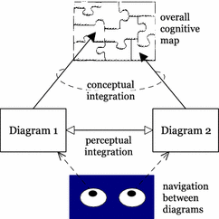
This principle only applies when multiple diagrams are used to represent a problem situation. Using multiple diagrams places additional cognitive demands on the reader to mentally integrate information from different diagrams and keep track of where they are in the system of diagrams [76]. Kim et al. [30, 38] have proposed a theory to address this issue, called the cognitive integration of diagrams (Fig. 33). According to this theory (which has been validated in an RE context), for multi-diagram representations to be cognitively effective, they must include explicit mechanisms to support:
Conceptual integration: to enable readers to assemble information from separate diagrams into a coherent mental representation of the system.
Perceptual integration: perceptual cues to simplify navigation and transitions between diagrams.
Fig. 33
Cognitive Integration: when multiple diagrams are used to represent a domain, explicit mechanisms are needed to support perceptual and conceptual integration
Currently, cognitive integration is not a major problem in i* as there are only two diagrams to integrate (as there are only two diagram types and each is represented as a single diagram). However, introducing complexity management (as described in the previous section) introduces cognitive integration problems, as it multiplies the number of diagrams.
9.2.1 Naming of diagram types
The current names for the i* diagram types (Strategic Dependency and Strategic Rationale) are too similar and easily confused. In particular, "strategic" acts as a “noise word” as it lacks a precise meaning and is overused in most business contexts. It also performs no differentiating function as it prefixes both diagram types.
The use of different symbols to represent actors on SD and SR diagrams (discussed under Semiotic Clarity) makes the link between the diagram types unclear.
9.2.3 Lack of overview (conceptual integration)
An important mechanism to support conceptual integration is a longshot diagram, a diagram that provides an overview of the system as a whole. This acts as an overall cognitive map into which information from individual diagrams can be assembled [38, 72]. Examples of such diagrams are rich pictures in the Soft System Methodology and context diagrams in DFDs. While i* includes a top level diagram (the SD diagram), this is too complex to provide an effective overview (e.g. see Fig. 30). As Estrada et al. [19] say:
The dependency model is too concrete to serve as starting point for the analysis of a large enterprise. In such cases, it may contain many actors with a large number of dependencies corresponding to different business processes, whose union constitutes a very complicated model to manage.
9.3 Recommendations for improvement
9.3.1 Naming of diagram types
Alternative names for the diagram types could be:
Actor Dependency Diagram: top level diagram showing dependencies among actors.
Actor Rationale Diagrams: diagrams for each actor showing their internal rationale or intentions.
These names are more indicative of the content of each diagram and less likely to be confused with each other.
To more clearly show the link between the SD and SR diagrams, the same symbol should be used to represent actors on both diagram types, as the SR diagram is really just a refinement of the SD diagram. One way of doing this would be to use the stick figure on both diagrams, but with the head expanded on the SR diagram to show the “inner workings” of each actor’s mind (Fig. 34). This would also resolve the problem of symbol redundancy identified in Semiotic Clarity.
Fig. 34
Using the same (but expanded) shape for actors on SR diagrams provides a clearer link between the diagrams and a clearer indication of the role of each diagram
Contextualisation (or focus+context) is a technique used in information visualisation where the part of a system of interest (the focus) is displayed in the context of the system as a whole [41, 81]. This could be applied in SR diagrams by exploding a single actor at a time (the focus), while showing dependencies with all other actors (the context). All actors apart from the focus would be shown in “black box” form (as on the SD diagram). Currently, the SR diagram shows all actors in “glass box” form, leading to uncontrolled complexity.
9.3.4 Create an overview diagram (conceptual integration)
Currently, the SD diagram is too complex to provide an effective overview or longshot diagram. This is one of the limitations of the complexity management approach proposed in the previous section: while it provides a way of decomposing the SR diagram, the SD diagram remains as a single monolithic diagram.
This problem is difficult to resolve within the existing i* diagram architecture, where the SD diagram shows all actors and dependencies among them and the SR diagram explodes each actor. One solution would be to create an overview diagram that shows only a subset of elements on the SD diagram e.g. the central actors and their most important goals. This should be limited to 7 ± 2 elements so that it is cognitively manageable. Each element on this diagram can then be recursively decomposed to as many levels as required. This would remove the (somewhat artificial) distinction between SD and SR diagrams that currently exists in i*. In this new proposal, there would be a single diagram type, shown at multiple levels of abstraction. There would be no restriction on the type of elements that can appear on each diagram, only on their number.
10 Visual Expressiveness
10.1 Definition of principle
The visual expressiveness of a notation is defined by the number of different visual variables used and the range of values (capacity) used of each variable: this measures utilisation of the graphic design space. Using a variety of visual variables results in a perceptually enriched representation that exploits multiple visual communication channels.
The choice of visual variables should not be arbitrary but should be based on the nature of the information to be conveyed [4]. Different visual variables have properties that make them suitable for encoding different types of information. For example, colour can only be used for nominal data as it is not psychologically ordered [39].
10.2 Results of evaluation
Currently, i* uses three visual variables (shape, brightness, and orientation), resulting in a visual expressiveness of 3. This is more than most RE visual notations, which typically only rely on a single visual variable (shape). Another positive aspect is that the i* symbol set uses more curved shapes than most RE visual notations, which mostly rely on rectangles or rectangle variants. Curved shapes are both more perceptually efficient and aesthetically pleasing [3, 71]. Overall, i* does well on this criterion compared to most RE visual notations, but there is still room for improvement. In particular, it uses only two levels of brightness (dotted vs. solid lines) and a limited range of shapes (all abstract geometrical shapes). Iconic and 3D shapes are not used at all, even though these are more perceptually and cognitively effective than abstract 2D shapes [34, 87].
10.2.1 Informal and ineffective use of colour
Colour is one of the most cognitively effective of all visual variables: the human visual system is highly sensitive to variations in colour and can quickly and accurately distinguish between them [49, 88]. Differences in colour are detected three times faster than shape and are also more easily remembered [47, 79]. However, if not used carefully, colour can undermine communication.
Currently, colour is not used effectively in i*. Most examples in the i* Guide use blue text on a green background for symbols (e.g. Fig. 35) but use of colour is not explicitly mentioned in the text, making it unclear whether this an official part of the visual syntax. Whether it is or not, it certainly does not represent effective use of colour:
All symbols are the same colour, meaning that colour plays no role in differentiating between symbols (Perceptual Discriminability). In fact, colour does not convey any additional information, which is why it is not included in the calculation of i*’s visual expressiveness (a variable only adds to visual expressiveness if it is used to encode information).
Coloured text on a coloured background reduces understanding of text and is the worst possible combination for both legibility and aesthetics [86]. This means that the use of colour actively undermines communication.
10.3 Recommendations for improvement
10.3.1 Effective use of colour
A common misconception is that use of colour should be defined as part of tool support rather than the notation itself. In the case of i*, use of colour is not formally prescribed in the notation so different software tools apply different colour schemes (e.g. [50]). However, like complexity management, use of colour should not be left up to tool designers to implement in idiosyncratic and possibly suboptimal ways (e.g. using colours that are not reliably discriminable or reduce legibility of text). Effective use of colour should be prescribed at the notation level to avoid such problems.
Colour could be used to increase the visual expressiveness of i* by using different colours to distinguish between symbols (Fig. 36). The colours are chosen to be as discriminable and mnemonic as possible:
tasks are yellow (the standard colour for “sticky notes”)
resources are green (like trees)
softgoals are pink (suggesting “softness” or “fluffiness”)
goals are white (like footballs)
In this case, colour is used to communicate rather than to decorate: it helps both to distinguish between symbols (Perceptual Discriminability) and suggest their meaning (Semantic Transparency). Note that colour is only used redundantly, to reinforce differences in shape and brightness. Colour should never be used as the sole basis for distinguishing between symbols, as it is highly sensitive to differences in visual perception (e.g. colour blindness) and printing/screen technology (e.g. black and white printers). Robust design means designing symbols so they are impervious to such differences. Figure 37 shows how the differences between symbols are preserved even in conversion to black and white (the strongest test for robust design).
Fig. 37
Robust design: even when symbols are reproduced in black and white, they remain highly discriminable due to differences in shape and brightness
10.3.2 Dependency strengths (level of vulnerability)
As discussed in Semiotic Clarity and Perceptual Discriminability, i* makes extensive use of textual encoding to distinguish between different types of relationships. However, it also uses text to encode properties of relationships (e.g. as UML does for multiplicities). For example, different dependency strengths or vulnerability levels for strategic dependencies are distinguished by placing different letters next to the lines (Fig. 38: left). Where possible, information should be encoded graphically (using visual variables rather than text or typographical characteristics) to take maximum advantage of the power of human visual processing. Because dependency strength is an ordinal property, ordinal visual variables need to be used to encode this information. Figure 38 (right) shows how dependency strengths could be encoded graphically. Three visual variables are used in this representation: brightness (dotted lines for open dependencies), size (thick lines for committed dependencies), and colour (red for critical dependencies).
Fig. 38
Dependency strengths. Left: textual encoding of dependency strengths: O = open, X = critical and no label = committed; right: graphical encoding of dependency strengths: dotted lines for open dependencies, thick red lines for critical dependencies
Many of the recommendations in this paper have involved introducing additional visual variables or expanding the range of values used of a particular visual variable:
Actors and intentional elements (Semantic Transparency): greater range of shapes (iconic and 3D), brightness
task decomposition relationships (Semantic Transparency): vertical position (y), horizontal position (x), and shape
Colour coding of intentional elements (Visual Expressiveness): colour
dependency strengths (Visual Expressiveness): colour, brightness, and size
Visual saturation refers to the use of the full range of visual variables (the maximum level of visual expressiveness). If all these recommendations were implemented, the visual expressiveness of i* would reach the point of visual saturation, the first RE notation ever to achieve this.
10.4 Interactions with other principles
Increasing Perceptual Discriminability almost always increases visual expressiveness as increasing visual distance involves using a greater range of visual variables and/or a greater range of values. Visual expressiveness also assists Graphic Economy.
11 Dual Coding
11.1 Definition of principle
Perceptual Discriminability and Visual Expressiveness both advise against using text to encode information. However, this does not mean that text has no place in visual notations. According to dual coding theory [66], using text and graphics together to convey information is more effective than using either on their own. This suggests that textual encoding is most effective when it is used in a supporting role: to supplement rather than to substitute for graphics. In particular, text should never be used as the sole basis for distinguishing between symbols, but can be usefully used as a form of redundant coding, to reinforce and clarify meaning.
11.2 Results of evaluation
Currently, i* only uses text or graphics on its own to encode information in its symbol set, so makes no use of Dual Coding.
11.2.1 Labelling of elements
Labels play an important role in interpretation of diagrams and in defining their real world semantics. Many of the examples in the i* Guide use a distinctive convention for labelling diagram elements, called the Type [Topic] notation (e.g. see Fig. 35). However, the rules for formulating such labels and how to interpret them are not explained.
One of the most unusual features of i* is that all relationship labels on diagrams are drawn from a predefined vocabulary of reserved words (e.g. plays, covers, help, and hurt) rather than allowing users to define domain relevant labels. This is something more commonly associated with programming languages than RE notations and is a side-effect of using labels to differentiate between relationship types (Perceptual Discriminability).
A final problem is that most relationships on i* diagrams don’t have labels at all (e.g. see Fig. 35): in particular, strategic dependencies, task decomposition, and means-end relationships. Currently, i* only uses relationship labels for differentiating between relationship types, which is an inappropriate use of labels (as explained in Perceptual Discriminability).
11.2.2 Definitions of elements
The interpretation of most RE diagrams depends on a division of labour between graphics and text [27, 63]. At some level, diagrams need to be supported by detailed definition of elements: for example, in DFDs, processes can be decomposed to multiple levels but at the bottom level must be defined in textual form. Similarly, in ER diagrams, attributes must be defined in textual form. These definitions form an important part of the notation, and without these the model is incomplete. Unlike most other RE notations, i* models are represented only by diagrams and lack supporting element definitions, suggesting that they are not fully specified. The i* Guide does not specify what attributes are required to define each construct apart from naming them, and even this is not required for relationships.
11.3 Recommendations for improvement
11.3.1 Define naming guidelines
Labelling of RE diagrams is typically done in an ad hoc manner in practice [53]. Defining clear guidelines for naming elements can help improve communication of diagrams. In particular, the implicit system for naming i* elements (the Type [Topic] notation) needs to be explicitly defined. In addition, naming processes in verb-object form has been recently found to improve understanding of process models [53], so could be used for naming tasks.
11.3.2 Label all relationships
For diagrams to be effectively understood, relationships should be labelled [16, 40, 44, 57, 77]. To support this, guidelines for formulating such names should be defined. For example, there are (at least) 4 options for naming strategic dependencies (illustrated in Fig. 39):
Fig. 39
Options for naming strategic dependencies: in all cases, relationships are read from left to right; different terms would be required for different intentional elements
Define role names (nouns) i.e. depender versus dependee. One problem with this approach is that these are very similar words and therefore easily confused. Another problem is that the meaning of these terms would not be understood by the average business user as they are not commonly used in everyday languageFootnote 8.
(b)
Define relationship names so that separate sentences can be formed involving each actor and the dependum (verbs or verb clauses). Different verbs would be required for different types of intentional elements (e.g. task is performed by, goal/softgoal is satisfied by, resource is provided by)
(c)
Define relationship names so that a single sentence can be formed involving both actors and the dependum (verb + clause).
(d)
User-defined labels with guidelines for formulating them [e.g. following either (b) or (c)]
The advantage of options (b), (c), and (d) is that they could be used to produce a normative language from diagrams [33], which supports Cognitive Fit.
11.3.3 Supporting definitions
Diagrams should be supported by detailed definitions of elements at the lowest level. An explicit metamodel would help here by defining the mandatory and optional properties for each construct (e.g. as the UML metamodel does [64]). For example, a key difference between goals and softgoals is that goals have measures: this defines a mandatory property of goals (and a non-allowed property of softgoals). This would also provide a check on whether elements have been classified correctly (i.e. to define something as a goal, at least one measure must be specified).
11.3.4 Annotations
Including textual explanations (annotations) can improve understanding of diagrams in the same way comments improve understanding of programs. Following the principle of spatial contiguity [52], including these on the diagram is more effective than including them in a separate document (as is common in practice). An example of design excellence here is UML (Fig. 40), which includes a comment construct, though representing it using a graphical symbol is not a good representational choice (this represents symbol excess (Semiotic Clarity) [60]). A simple block of text would be less intrusive and less likely to be misinterpreted. Including comments on i* diagrams would help improve their comprehensibility to end users.
Fig. 40
Annotations: the UML comment is a useful notational feature but should not be shown using an explicit graphical symbol. Annotations would be a useful addition to i*
Graphic complexity refers to the number of different symbol types in a notation: the size of its visual vocabulary [62]. Empirical studies show that graphic complexity significantly reduces understanding of RE diagrams, especially by novices [62]. The reason is that the human ability to discriminate between perceptually distinct alternatives (span of absolute judgement) is around 6 categories [54]: this defines an effective upper limit for graphic complexity.
12.2 Results of evaluation
i* has a graphic complexity of 16, which exceeds the span of absolute judgement by an order of magnitude.Footnote 9 Such a level of graphic complexity would be a problem for any visual notation, but particularly for one intended for use in early analysis.
12.3 Recommendations for improvement
There are four primary strategies for dealing with excessive graphic complexity:
12.3.1 Reduce semantic complexity
Semantic complexity (as defined by the number of semantic constructs in a notation) is a major determinant of graphic complexity, as different constructs are usually represented by different symbols (following the Principle of Semiotic Clarity). The number of constructs in i* [31] seems excessive for a notation designed for early analysis and greatly exceeds most other early analysis techniques (e.g. UML use cases) and even later analysis techniques (e.g. ER, DFDs). Such a level of semantic complexity makes it difficult to design an effective visual notation for communicating with end users. This provides a clear case for simplifying the semantics of i*. For example, we could ask the question: is it really necessary to distinguish between different types of actors? However, such questions are beyond the scope of this paper, which focuses on syntactic issues.
12.3.2 Partition semantic complexity
Another way of dealing with excessive semantic complexity is to partition metamodel constructs into different diagram types (à la UML), so that the graphic complexity of each diagram type is cognitively manageable. For example, different diagram types could be defined for actor dependencies, softgoal contributions, task decomposition, and means-end analysis, with each diagram type limited to a subset of constructs and relationships in the metamodel (though this would introduce problems of Cognitive Integration).
12.3.3 Introduce symbol deficit
Graphic complexity can also be reduced directly (without affecting semantics) by introducing symbol deficit (Semiotic Clarity). This means choosing not to show some constructs in graphical form. The mistake that many RE notations make is to try to show too much information on diagrams, which beyond a certain point reduces their cognitive effectiveness. Judicious use of symbol deficit is one of the most effective ways to reduce graphic complexity. For example, the question could be asked: even if it is necessary to distinguish between the different types of actor at the semantic level, do we need to distinguish between them at the syntactic level? Removing this distinction would reduce graphic complexity by 3 in a single stroke.
As a more radical proposal, i* currently includes 9 different types of contribution links. We could ask the question: do these need to be shown on the diagram at all? While this may seem to conflict with Visual Expressiveness, diagrams are good for representing some types of information but not others [27]. Interactions among elements can often be more effectively shown using matrices (e.g. CRUD matrices, quality matrices). A good example of this is the figure defining the interactions among the Physics of Notations principles (Fig. 5). Trying to show these in the form of a diagram results in a representation that is very difficult to understand. The advantage of matrices for showing interactions is:
They avoid the “tangled web” problem as matrices are not significantly affected by the number of relationships among elements (the density or interactivity of the representation).
They support systematic analysis of interactions: a missing cell in a matrix is much more obvious than as a missing link in a diagram.
Removing contributions from the visual notation would reduce graphic complexity, diagrammatic complexity (Complexity Management), and symbol overload (Semiotic Clarity).
12.3.4 Increase visual expressiveness
This is an approach to dealing with excessive graphic complexity that works not by reducing the number of symbols but by increasing human discrimination ability. The human ability to differentiate between stimuli can be expanded by increasing the number of perceptual dimensions on which stimuli differ [54]. Using multiple visual variables to differentiate between symbols (Visual Expressiveness) can increase human discrimination ability in an almost additive manner.
12.4 Interactions with other principles
Graphic Economy has important interactions with Semiotic Clarity, Visual Expressiveness and semantic complexity:
Removal of symbol excess and redundancy has a positive effect on Graphic Economy.
Symbol deficit and symbol overload have positive effects on Graphic Economy, even though these are violations of Semiotic Clarity. In this sense, Semiotic Clarity has a negative effect on Graphic Economy.
Visual Expressiveness has a positive effect on Graphic Economy by increasing the number of symbols that can be reliably discriminated.
Increasing semantic complexity has a negative effect on Graphic Economy (if Semiotic Clarity is held constant).
Because of the semantic complexity of most SE notations, tradeoffs often need to be made between Semiotic Clarity and Graphic Economy. Symbol overload is a common (but suboptimal) way of reducing graphic complexity. Symbol deficit is a much more effective way of doing this and has the added advantage of reducing diagrammatic complexity.
13 Cognitive Fit
13.1 Definition of principle
Most RE notations use a single visual notation for all purposes. However, cognitive fit theory [74, 82, 83] suggests that this “one size fits all” assumption may be inappropriate and that different representations may be required for different tasks and/or audiences (“representational horses for cognitive courses” [70]). According to this theory, problem solving performance (≈ cognitive effectiveness) is determined by a three-way fit between the problem representation, task characteristics, and problem solver skills (Fig. 41).
Fig. 41
Cognitive fit is the result of a three-way interaction between the representation, task, and problem solver [82]
There are at least four reasons for creating multiple visual dialects in an RE context:
Expert-novice differences (problem solver skills): when notations are used to communicate with technical experts (e.g. developers) and novices (e.g. end users)
Representational medium (task characteristics): when notations are used both for hand drawing and computer-based tools.
Cultural differences: when notations are used in different cultural contexts. This is not something that has so far been considered in cognitive fit theory, but seems increasingly applicable in our globalised world.
Verbal versus spatial ability (problem solver skills): people differ in their ability to process information in textual versus graphical form.
13.2 Results of evaluation
Currently, i* consists of a single visual dialect used for all purposes, so does not support Cognitive Fit.
13.2.1 Expert-novice differences
This reason for having multiple visual dialects does not really apply to i*. As an early analysis technique, it is only used for communicating with business specialists as the models produced are not directly used as a basis for implementation (unlike, for example, ER or UML models). This means that only one visual dialect is required, but this should be tailored for novices. Notations designed for communication with novices should use easily discriminable symbols (Perceptual Discriminability), mnemonic conventions (Semantic Transparency), reduced complexity (Complexity Management), supporting text (Dual Coding) and a simplified visual vocabulary (Graphic Economy) [58]. Currently, i* fares poorly on all of these principles, which suggests that expert-novice differences were not taken into account in its design.
13.2.2 Representation medium differences
An important consideration in designing RE visual notations is that they must be easy to draw by hand. Especially in the early stages, models are developed in an interactive manner by sketching on whiteboards or paper. It is therefore important that diagrams can be drawn quickly and easily, and do not slow down the flow of ideas. Hand drawing presents special challenges for visual notation design because of the limited drawing abilities of most requirements engineers (as drawing is typically not a skill included in IT curricula). Some of the important notational requirements are:
Perceptual Discriminability: discriminability requirements are higher due to variations in how symbols are drawn by different people.
Semantic Transparency: pictures and icons are more difficult to draw than simple geometric shapes, especially for the artistically challenged.
Visual Expressiveness: some visual variables (colour, value, and texture) are more difficult to use (due to limitations in drawing ability and availability of equipment e.g. colour pens).
The existing i* symbol set presents some challenges for hand drawing: actors, goals and beliefs are likely to look very similar when drawn by hand (as they are all variants of circles); softgoals and positions are difficult to draw as they are irregular shapes. The proposed new symbol set presents even greater problems for hand drawing, as it introduces iconic representations and additional visual variables.
13.2.3 Cultural differences
As the i* symbol set consists entirely of abstract symbols, it is unlikely to cause problems in different cultural contexts.
13.2.4 Verbal versus spatial ability
Currently, i* relies only on diagrams to communicate, so does not take into account user preferences for receiving information in verbal or graphical form.
13.3 Recommendations for improvement
13.3.1 Expert-novice differences
The i* visual notation should be tailored for communication with novices, which means optimising Perceptual Discriminability, Semantic Transparency, Complexity Management, Dual Coding and Graphic Economy.
13.3.2 Representation medium differences
To support Cognitive Fit, visual notations should provide a simplified visual dialect for initial sketching and an enriched dialect for final production of diagrams: this allows the best of both worlds (ease of drawing and cognitive effectiveness). Figure 42 shows a simplified symbol set (based on the one proposed in Fig. 36) that would be suitable for sketching. These symbols are easy to draw even for the most artistically challenged requirements engineer, are highly discriminable and sufficiently similar to the enriched symbol set not to cause confusion.
Note that symbols for actor types (role, position, agent) are not included in this symbol set. Ease of hand drawing would favour not distinguishing between different types of actors (as suggested in Graphic Economy) rather than using different symbols (as suggested in Semantic Transparency and the existing symbol set).
13.3.3 Cultural differences
The proposed new symbol set presents some potential problems as it draws on culture-specific associations: this is a common side-effect of increasing Semantic Transparency, which often draws on cultural associations. For example, representing goals using circles is likely to be less effective in North America or Australia, where footballs are generally a different shape. This may suggest the need for region-specific dialects of the notation (Fig. 43). Footnote 10
Fig. 43
Cultural differences about the meaning of the word football may require “rugby” and “soccer” dialects of the i* notation
An alternative solution would be to use the same symbol but different sporting associations depending on the context (e.g. football in the United Kingdom, basketball in the United States, and ice hockey in Canada). Circles are associated with goals in many different sports (Fig. 44).
Fig. 44
Circles are associated with goals in a wide range of sports: (from left) soccer, basketball (basket + ball), ice hockey, darts, archery, shooting
A systematic approach to naming diagram elements and relationships as suggested in Dual Coding can be used to generate verbal representations of i* models. This represents a normative language [33], which would support users who prefer verbal representations of information.
14 Conclusion
This paper has conducted a systematic, symbol-by-symbol analysis of i* visual syntax, based on a set of theoretically and empirically grounded principles for visual notation design. The analysis has revealed some serious flaws in the i* visual notation that have gone unrecognised for more than a decade. We argue that these represent a barrier to its usability and effectiveness in practice, especially for communicating with end users. We have also made practical recommendations for addressing (most of) the problems identified.
14.1 A simplified visual vocabulary for i*
It is beyond the scope of this paper to propose a new visual notation for i*. Our primary goal was to evaluate existing visual representation choices (which have so far gone unquestioned) and to consider some of the alternatives available in the graphic design space. However, as a starting point for discussion, we have proposed a simplified (partial) visual vocabulary for i* based on some of the recommendations in this paper (Fig. 45).Footnote 11 Compared to the existing symbol set (Fig. 13), this is more:
Semiotically clear: it contains no synographs or homographs.
Perceptually discriminable: the shapes used come from different shape families and are therefore unlikely to be confused. They also incorporate redundant coding to further increase visual distance.
Semantically transparent: shapes and colours are used that suggest the meaning of the underlying concepts. While it would be difficult for a novice to infer the meaning of the symbols without explanation, all have mnemonic associations with their referent concepts to aid learning, recognition and recall.
Visually expressive: it uses three visual variables (colour, shape, brightness) instead of only one (shape) and uses a greater range of shapes. It is also robust to variations in visual perception and printing technology (e.g. conversion to black and white).
Graphically economical: the size of the visual vocabulary is reduced by eliminating symbol redundancy and introducing symbol deficit (eliminating actor subtypes).
14.1.1 The importance of design rationale
Explicit design rationale is included for all symbols in the proposed new symbol set, whereas the existing i* symbol set lacks this for any of its symbols. Further, none of the graphic design decisions in constructing this symbol set are arbitrary: not just each symbol but each visual property of each symbol (i.e. the value chosen for each visual variable) is justified with reference to visual notation design principles. This is the lowest level of granularity of design rationale possible, as visual variables form the atomic elements of graphical symbols (Fig. 46). Finally, visual representation choices are justified using theory and empirical evidence rather than common sense, opinion or personal taste.
Fig. 46
Design rationale should be specified at the lowest level of granularity (visual properties) and should be based on theory and/or empirical evidence
Articulating the reasons behind graphic design choices can help in two major ways:
It can help notation users learn and remember what symbols mean
It opens up the visual representation debate beyond the notation designers themselves. If notation users are aware of what the notation designers were trying to achieve in constructing particular symbols, they can contribute their own ideas, which could lead to new and innovative designs.
14.2 Contributions of the research
The practical contribution of this research has been to suggest ways of improving the cognitive effectiveness of the i* visual notation. These can be used to improve its usability and effectiveness in practice, and remove potential barriers to its adoption in practice.
The theoretical contribution of this research is that it has conducted the first analysis of i* visual syntax. While there have been many papers published on goal modelling in general and i* in particular, this is the first to focus exclusively on visual representation aspects. A second contribution has been to demonstrate a systematic approach to evaluating and improving visual notations, which could be applied to any RE visual notation. Finally, this is the first application of the Physics of Notations in an RE context. The analysis demonstrates its applicability to RE notations and extends the theory by identifying cultural and verbal/spatial ability differences as considerations in Cognitive Fit.
14.3 Limitations of the research
An obvious limitation of this research is that it focuses only on syntactic issues. Addressing some of the problems identified in this paper (e.g. Graphic Economy) will require re-examining the semantics of i*, which is beyond the scope of this paper.
Another limitation is that the recommendations from different principles sometimes conflict with one another (e.g. how to represent contributions in Perceptual Discriminability and Graphic Economy). There are always tradeoffs between objectives in any design task [1], and these would need to be resolved to produce an improved visual notation.
Finally, the recommendations for improving the visual notation have not been empirically tested. However, there are sound reasons for predicting that they will improve cognitive effectiveness as they are based on theory and empirical evidence (encapsulated in the Physics of Notations). In any case, it would be premature to empirically test these ideas at this stage as they are initial suggestions only, to provide a starting point for discussion: more work is needed to develop these further and explore alternative solutions, preferably with input from i* users and researchers.
14.4 Further research: next steps
This paper should not be seen as the final word on i* visual syntax but a starting point for further research. The recommendations in this paper represent some initial ideas for improving the notation but are only the tip of the iceberg in terms of what is possible. Our aim was to provide some concrete suggestions as a starting point for debate, a debate which has not yet begun in the i* community and is long overdue.
In many ways, the paper raises more questions than it answers. For example, we have provided a number of suggestions for improving complexity management in i* but these fall short of providing a complete solution (which is probably a paper in its own right). Part of the reason for this is the (necessarily) broad scope of this paper. As the first paper to explicitly address i* visual syntax, it was appropriate to consider all principles at once but future research might more productively focus on individual principles.
Finally, this paper has suggested some ways of improving the i* visual notation using the existing notation as a base. However, a more productive approach might be to start from first principles: to forward engineer a new visual notation based on an explicit metamodel and following sound ontological principles [28]. Ideally, visual notation design should proceed from a stable metamodel and formal semantics rather than reverse engineering a metamodel after the event: form follows content.
14.5 Beyond i*: the importance of visual syntax in RE notations
This paper should be seen not just as a critique of i* but of RE visual notations in general, which are mostly designed in a similar way and have similar problems. i* is used as just one example, chosen because of its popularity and influence in the RE community. UML makes many of the same mistakes despite the much greater resources invested in developing it (see [60] for a similar analysis of UML). The broader message of this paper is that we need to follow sound principles in designing visual notations rather than relying on intuition and experience. Cognitive effectiveness is not an inherent property of visual notations but something that must be designed into them [42]: this requires significant effort and expertise.
To design more effective RE visual notations we need to:
(a)
Invest as much effort and attention into designing visual syntax of RE notations as we currently invest in their semantics.
(b)
Provide explicit design rationale for visual representation choices, down to the level of individual visual variables. This will force notation designers to think carefully about visual representation decision and explicitly consider alternatives rather than making arbitrary (or default) choices.
(c)
Justify visual representation choices using theory and empirical evidence rather than common sense. The effects of graphic design decisions are often counterintuitive and relying on intuition can lead us horribly astray.
Notes
Also called graphical notations, diagramming notations or visual languages.
Rather than defining the principles in detail here, they are defined as they are used in the analysis.
means-end links are allowed between goals in original i* [89] but not in the i* Guide (which we used as the basis for our analysis). No explanation is given for this discrepancy.
Note: if the 9 types of contributions are not considered as separate relationship types (but a single relationship type with different properties like dependency strengths), they will be treated under Perceptual Discriminability or Visual Expressiveness. In other words, using text to differentiate between contribution types will be a problem whether or not they are considered to be separate constructs: the problem will just be classified differently.
According to private communications with i* researchers, the position symbol is meant to represent 4 Actor symbols superimposed on each other, to suggest multiple roles. However we were unable to find this design rationale documented anywhere. If it was, it would provide an aid to remembering what the symbol means and explaining it to users (Semantic Transparency). This provides a strong argument for including explicit design rationale when defining visual notations: it is highly undesirable for design rationale to be disseminated by word of mouth.
Symbol overload is a special case of perceptual discriminability where (a) there is zero visual distance between symbols and (b) symbols are used to represent different semantic constructs.
Aside from the issue of textual differentiation, there is a discriminability problem with the labels chosen in that relationships with opposite meanings have similar-looking (e.g. Hurt/Help) or similar-sounding (e.g. Make/Break) labels.
Neither of these words are recognised by the Microsoft Word spell checker, which suggests they form part of a specialised vocabulary rather than standard English usage.
The graphic complexity of i* is artificially deflated by the high level of symbol overload. If this was resolved, graphic complexity would become a much greater problem. Symbol overload is a common, but cognitively ineffective, way of dealing with excessive graphic complexity.
The circle representation could be justified by the fact that soccer is the most popular sport in the world (considered to be the “world game”), so could be argued to transcend international boundaries.
Note: this is not a complete symbol set as it does not include relationship types.
References
Alexander CW (1970) Notes on the synthesis of form. Harvard University Press, Boston, p 224
Ayala CP, Cares C, Carvallo JP, Grau G, Haya M, Salazar G, Franch X, Mayol E, Quer C (2005) A comparative analysis of i*-based agent-oriented modeling languages. In: Proceedings of the international workshop on agent-oriented software development methodology (AOSDM’2005)
Bar M, Neta M (2006) Humans prefer curved visual objects. Psychol Sci 17(8):645–648
Bertolini D, Perini A, Susi A, Mouratidis H (2005) The TROPOS Visual Modeling Language: A MOF 1.4 Compliant Metamodel. In: Agent-oriented software engineering technical forum. Ljubljana, Slovenia
Bresciani P, Perini A, Giorgini P, Giunchiglia F, Mylopolous J (2004) TROPOS: an agent-oriented software development methodology. Auton Agent Multi Agent Syst 8:203–236
Britton C, Jones S (1999) The untrained eye: how languages for software specification support understanding by untrained users. Hum Comput Interact 14:191–244
Bubenko JA (1986) Information systems methodologies—a research view. In: Olle TW, Sol HG, Verrijn-Stuart AA (eds). Information systems design methodologies: improving the practice. North-Holland, pp 289–312
Card SK, Mackinlay J (1997) The structure of the information visualization design space. In: Proceedings of the 1997 IEEE symposium on information visualization (InfoVis ‘97)
Checkland PB, Scholes J (1990) Soft systems methodology in action. Wiley, Chichester
Cheng BH, Atlee JM (2007) Research directions in requirements engineering. In: International conference on software engineering (ICSE07). IEEE Computer Society, Washington, DC, USA
Citrin W (1996) Strategic directions in visual languages research. ACM Comput Surv 24(4)
Costagliola G, Deufemia V, Polese G (2004) A framework for modeling and implementing visual notations with applications to software engineering. ACM Trans Softw Eng Methodol 13(4):431–487
Ernst NA, Yu Y, Mylopoulos J (2006) Visualizing non-functional requirements. In: First international workshop on requirements engineering visualization (REV 2006)
Estrada H, Rebollar AM, Pastor O, Mylopoulos J (2006) An empirical evaluation of the i* framework in a model-based software generation environment. In: CAiSE 2006 (LNCS 4001). Springer
Flood RL, Carson ER (1993) Dealing with complexity: an introduction to the theory and application of systems science. Plenum Press, New York
Goonetilleke RS, Shih HM, On HK, Fritsch J (2001) Effects of training and representational characteristics in icon design. Int J Hum Comput Stud 55:741–760
Hahn J, Kim J (1999) Why are some diagrams easier to work with? Effects of diagrammatic representation on the cognitive integration process of systems analysis and design. ACM Trans Comput Hum Interact 6(3):181–213
ISO/IEC, ISO/lEC Standard 24744: software engineering—metamodel for development methodologies. 2007: International Organization for Standardization (ISO), International Electrotechnical Commission (IEC)
ITU-T, languages and general software aspects for telecommunication systems. Formal description techniques (FDT)—user requirements notation (URN). User requirements notation (URN) Language definition, Z.151. 2008, Telecommunication Standardization Sector of ITU
Kim J, Hahn J, Hahn H (2000) How do we understand a system with (so) many diagrams? Cognitive integration processes in diagrammatic reasoning. Inf Syst Res 11(3):284–303
Lloyd KB, Jankowski DJ (1999) A cognitive information processing and information theory approach to diagram clarity: a synthesis and experimental investigation. J Syst Softw 45:203–214
Lockerbie J, Maiden NAM (2008) REDEPEND: tool support for i* modelling in large-scale industrial projects. In: CAiSE Forum 2008, pp 69–72
Lockerbie J, Maiden NAM (2008) REDEPEND: tool support for i* modelling in large-scale industrial projects. In: Proceedings of the forum at the CAiSE’08 conference. Montpellier, France
Lohse GL (1993) A cognitive model for understanding graphical perception. Hum Comput Interact 8(4):353–388
Moody DL (2002) Complexity effects on end user understanding of data models: an experimental comparison of large data model representation methods. In: Proceedings of the tenth European conference on information systems (ECIS’2002). Gdansk, Poland
Moody DL (2006) Dealing with “Map Shock”: a systematic approach to managing complexity in requirements analysis. In: Proceedings of the twelfth conference on requirements engineering: foundation for software quality (REFSQ 2006). Luxembourg, Grand-Duchy of Luxembourg
Moody DL (2006) What makes a good diagram? Improving the cognitive effectiveness of diagrams in is development. In: Proceedings of the 15th international conference on information systems development (ISD 2006). Budapest, Hungary
Moody DL (2009) The “Physics” of notations: towards a scientific basis for constructing visual notations in software engineering. IEEE Trans Softw Eng 35(5):756–777
Moody DL, Heymans P, Matulevicius R (2009) Improving the effectiveness of visual representations in requirements engineering: an evaluation of the i* visual notation. In: Proceedings of the 17th IEEE international conference on requirements engineering (RE09). IEEE Computer Society, Atlanta
Moody DL, van Hillegersberg J (2008) Evaluating the visual syntax of UML: an analysis of the cognitive effectiveness of the UML suite of diagrams. In: Proceedings of the 1st international conference on software language engineering (SLE2008). Springer Lecture Notes in Computer Science, Toulouse
Mylopoulos J, Borgida A, Jarke M, Koubarakis M (1990) Telos: representing knowledge about information systems. ACM Trans Inf Sys 8(4):325–362
Patrignani M (2003) Visualization of large graphs, in Dottorato di Ricerca (Doctoral Dissertation), Ingegneria Informatica. Università degli Studi di Roma: La Sapienza, Italy
Pedhazur EJ, Schmelkin LP (1991) Measurement, design and analysis: an integrated approach. Lawrence Erlbaum Associates, Hillsdale
Reber R, Schwarz N, Winkielman P (2004) Processing fluency and aesthetic pleasure: is beauty in the perceiver’s processing experience? Pers Soc Psychol Rev 8(4):364–382
Renkl A, Atkinson RK (2003) Structuring the transition from example study to problem solving in cognitive skill acquisition: a cognitive load perspective. Educ Psychol 38(1):15–23
Simsion GC, Witt GC (2000) Data modeling essentials: a comprehensive guide to analysis, design, and innovation, 2nd edn. The Coriolis Group, Scottsdale
Weber RA (1997) Ontological foundations of information systems (Coopers and Lybrand accounting research methodology monograph No. 4). Melbourne, Australia: Coopers and Lybrand, 212
Wheildon C (2005) Type and layout: are you communicating or just making pretty shapes?. Worsley Press, Hastings
Yu E (1995) Modelling strategic relationships for process reengineering (PhD thesis). Department of Computer Science, University of Toronto
Yu E (1997) Towards modelling and reasoning support for early-phase requirements engineering. In: Proceedings of the 3rd IEEE international conference on requirements engineering (RE’97). Washington DC, USA
This article is distributed under the terms of the Creative Commons Attribution Noncommercial License which permits any noncommercial use, distribution, and reproduction in any medium, provided the original author(s) and source are credited.
Author information
Authors and Affiliations
Information Systems & Change Management, University of Twente, Enschede, The Netherlands
Daniel L. Moody
Ajilon Consulting, 68 Pitt St, Sydney, Australia
Daniel L. Moody
PReCISE Research Centre, University of Namur, Namur, Belgium
Patrick Heymans & Raimundas Matulevičius
Institute of Computer Science, University of Tartu, Tartu, Estonia
Open Access This is an open access article distributed under the terms of the Creative Commons Attribution Noncommercial License (https://creativecommons.org/licenses/by-nc/2.0), which permits any noncommercial use, distribution, and reproduction in any medium, provided the original author(s) and source are credited.
Moody, D.L., Heymans, P. & Matulevičius, R. Visual syntax does matter: improving the cognitive effectiveness of the i* visual notation.
Requirements Eng15, 141–175 (2010). https://doi.org/10.1007/s00766-010-0100-1